DJI OSMO Pocket 3 Review: Unleashing the Power of Pocket-Sized Vlogging
The original DJI OSMO Pocket left a lasting impression with its remarkable ease of use, portability, and outstanding image quality. In contrast to DJI’s other flagship products that receive frequent updates, which can sometimes be challenging to keep up with, the OSMO Pocket’s updates have been slower and more deliberate.
Since its initial release back in 2019, the landscape has evolved significantly. Video content has emerged as a dominant format, with more creators opting for moving images rather than written or still imagery. Enter the new OSMO Pocket 3, a device that seems tailor-made for the modern vlogger and content creator.
It ticks all the boxes: exceptional video quality, advanced tracking capabilities, impressive battery life, compatibility with wireless microphones, and an unparalleled user-friendly interface. Vloggers might be considering larger alternatives like the Sony EV-10 and other cameras designed specifically for vlogging. However, why go through the hassle when you can have this compact, pocket-sized camera that not only matches but surpasses them all?
Build and Handling
Even before you see the logo, you know the DJI OSMO Pocket 3 is DJI. The design, build quality, and layout of the controls are all carefully considered and decidedly DJI. There are three brands that follow this quality of design and build in the action camera sector: GoPro, Insta360, and DJI. All have an equal footing in high-quality build and matching image quality.
You do, of course, pay a premium, but then, compared with all the competition I’ve seen, those three companies stand alone when it comes to making products designed to be functional and robust.
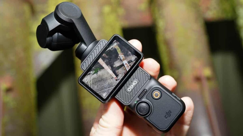
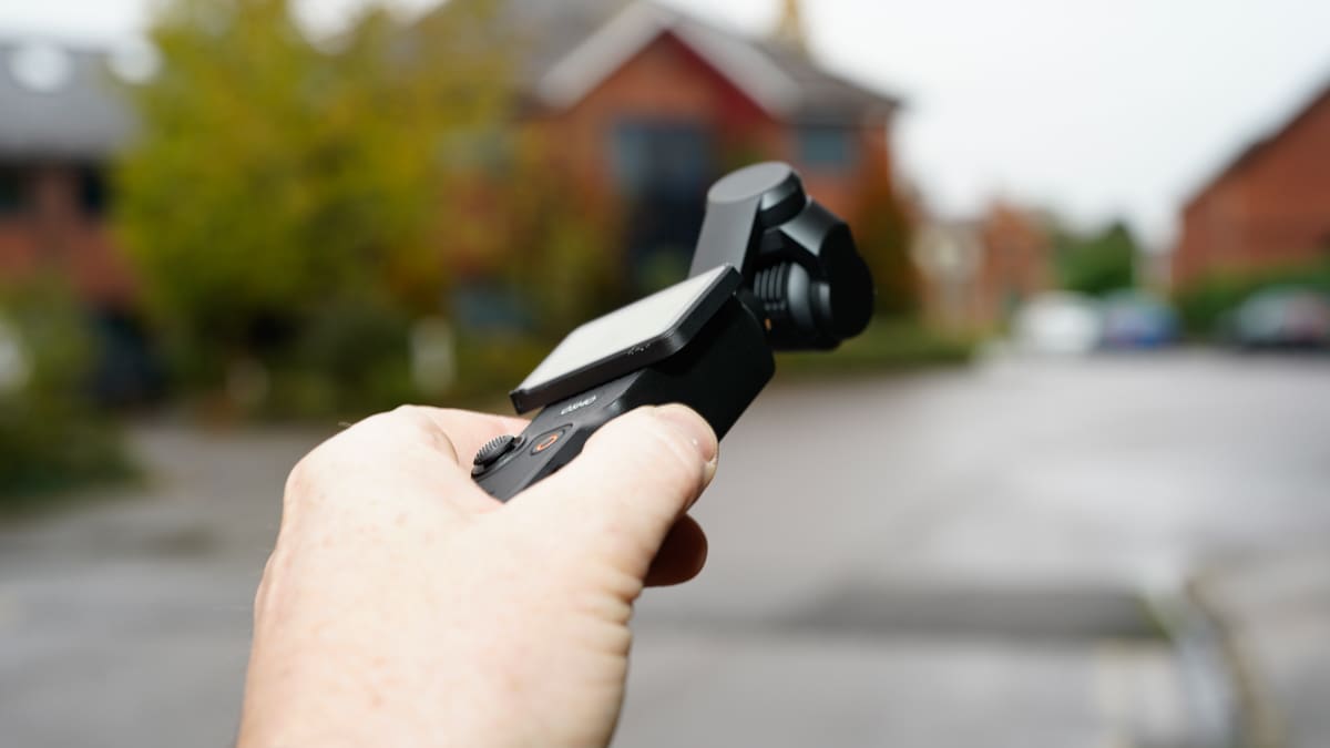
The OSMO Pocket 3 utilizes a high-quality matte plastic exterior with the camera combined into a small gimbal placed on top, as we’ve seen with the previous iterations. The big change here is the large LCD screen that spins from vertical to landscape format, giving you a preview of what you’re shooting, be that in portrait or landscape format depending on the footage’s intended final destination.
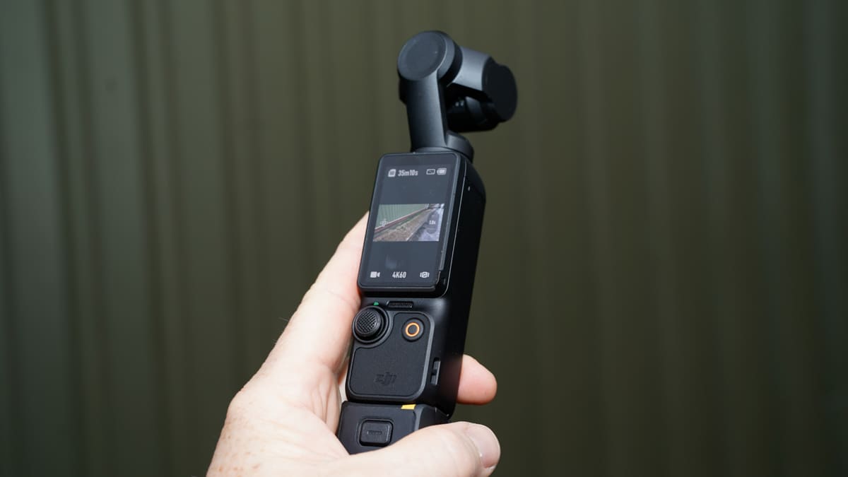
This screen is where the real changes are very obvious. To make room for the screen, the joystick and record button have been moved down the grip, which makes it a little awkward to hold without the additional battery grip fitted. Once that grip is in place, the design again starts to make more sense. While it does make the OSMO Pocket 3 taller, it’s still nice and compact, although less pocketable in clothing and more suitable for backpack pockets.
Once powered on, the OSMO follows the usual touchscreen interface, very similar to the superb OSMO Action 4, enabling you to navigate through the options and settings. For anything more in-depth, you need to dive into the Mimo App, available for both iOS and Android. The version I’ve been using in this review is the pre-release, and for once, everything seems really solid, offering loads of options. A few firmware updates also boosted some of the features and the base resolution and framerates.
Overall, the build quality is, as always from a DJI product, superb. The quality of the plastic used is extremely high quality, and the matte finish reinforces that premium feel. The design of the DJI OSMO Pocket has always been a little quirky, and this release is no different. While the layout has taken a slight hit to incorporate that rotating screen, the use of the screen comes into its own once in use. The battery grip is an accessory, but actually, if you’re taking things seriously, then it’s an essential addition, and once in place, the design layout suddenly makes sense.
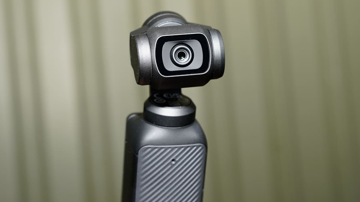
Essentially, you can keep the OSMO Pocket 3 small for day-to-day use and then give it a boost for power and handling when you need to use it a little more seriously.
There are a couple of additional points to add about the design and handling of the OSMO Pocket 3. The first is again about that battery grip. In the Combo Kit, you get a couple of these battery packs, and they don’t just help boost the camera’s battery power, but they also charge the internal battery. This means that you can keep the small OSMO Pocket 3 running all day without stopping. Just click off the battery base, replace it with a charged version, and off you go.
The second significant feature is the new wireless mic. It not only looks amazing with its smoky grey transparent casing but also connects and sounds amazing, essentially turning the OSMO Pocket 3 into the most incredible all-in-one video machine. In the test, I was able to tripod mount the OSMO Pocket 3, activate tracking and the wireless mic, and film a tutorial with great sound and visuals without issue. All really simple.
Specification
- Sensor: 1-inch CMOS
- Video Resolutions: 4K/120fps
- Stabilization: Three-Axis Mechanical
- Touchscreen: 2-inch Rotatable OLED
- Color Modes: 10-bit D-Log M, 10-bit HLG HDR
- Audio: Three-Mic Array, DJI Mic 2 Compatibility
- Battery Life: Up to 116 minutes (4K/60fps), Up to 166 minutes (1080p/24fps)
- Intelligent Features: ActiveTrack 6.0, Face Auto-Detect, Product Showcase Mode
- Creative Modes: SpinShot, Motionlapse, Digital Zoom, Panorama
Features
DJI has always been synonymous with innovation, and their latest offering, the OSMO Pocket 3, continues this tradition with a flourish. Packed to the brim with features that cater to both amateur videographers and seasoned content creators, this pocket-sized marvel promises a revolution in handheld imaging.
At it’s is a powerful 1-inch CMOS sensor. This sensor promises to deliver high quality footage, even in challenging lighting conditions. So that you can clearly see what it is your capturing especially if you’re doing a selfie shot the 2-inch rotatable touchscreen offers a clear perspective. Precise control is at your fingertips, allowing you to switch effortlessly between horizontal and vertical shooting.
Taking a leap up in video options the new Pocket offers video resolution and framerates up 4K at 120fps. This will enable you to capture smooth, cinematic sequences. Ensuring that those visulas aren’t corrupted by camera shake the three-axis mechanical stabilization system ensures steady images even during dynamic camera movements, and as with previous Pockets there’s plenty of adjustment over the reaction speeds.
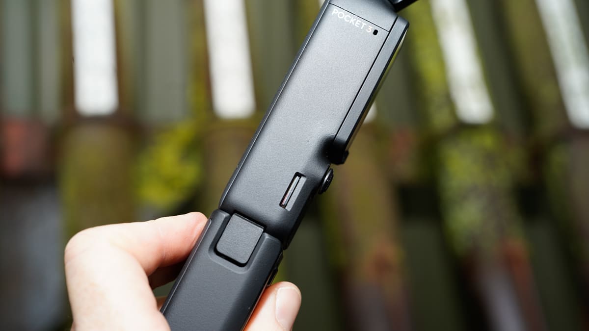
The OSMO Pocket 3 introduces a range of intelligent features. The 2-inch full-color OLED rotatable touchscreen simplifies control. It offers full-pixel fast focusing, ensuring sharpness even with fast-moving subjects. Plus, there’s a Product Showcase mode for seamless live streaming and product presentations, I feel these are a little Passé, but they may be to your taste!
Further supporting the smooth video capture is ActiveTrack 6.0. This feature includes multiple follow modes like Face Auto-Detect and Dynamic Framing all of which enable the camera to move and track your movements without any interaction from you.
A built-in three-mic array reduces wind noise and captures omnidirectional stereo sound. It’s perfect for immersive audio experiences. Additionally, DJI Mic 2 compatibility allows for dual-person recording, ideal for vlogs, interviews, and live streams.
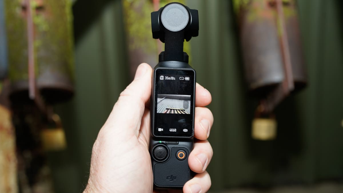
Glamour Effects 2.0 is one of the big easy access features and essentially does what it says on the tin.
The OSMO Pocket 3 charges to 80% in just 16 minutes. When fully charged, it’s ready to record up to 116 minutes of 4K/60fps footage or an impressive 166 minutes of 1080p/24fps content.
The OSMO Pocket 3 is a versatile creative tool. It adapts to any scenario, making it perfect for live streaming in high-definition. It can even function as a webcam for online meetings and video chats.For streamlined post-production, the built-in timecode function ensures your footage syncs seamlessly between different cameras.
The LightCut app offers a convenient One-Tap Edit feature. Using AI intelligent recognition, it highlights moments from your footage and generates shareable 4K videos, saving you valuable editing time. With a wide range of video templates, editing becomes a breeze, and you can transform raw footage into polished content in seconds.
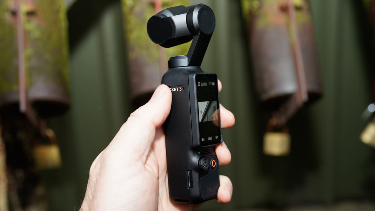
OSMO Pocket 3 is available with a series of versatile accessories. From filters and lenses to tripods and microphones, these add-ons complement your creativity, allowing you to capture the perfect shot. In the Combo Kit, you get a couple of battery packs. They not only boost the camera’s battery power but also charge the internal battery. This means you can keep the OSMO Pocket 3 running all day without interruption.
The new wireless mic is a game-changer. Its smoky grey transparent casing looks fantastic, but more importantly, it connects seamlessly and delivers incredible sound quality. It turns the OSMO Pocket 3 into an all-in-one video powerhouse, simplifying your recording setup and ensuring excellent audio.
Performance
In the “Build and Handling” section, I mentioned the importance of the battery handle for a comfortable grip during use. Initially, I tested the OSMO Pocket 3 without the grip to gauge its feel and operation, and to be honest, it wasn’t bad at all. In practice, I found that the joystick was rarely used, mainly for minor camera orientation adjustments.
As you use the OSMO Pocket, you’ll notice that the joystick is seldom needed, as the tracking feature handles most, if not all, of the work. Your primary task becomes simply pressing the record button. Other functions are straightforward, with the touchscreen providing quick access to different framerate and resolution options, as well as various other features.
The real fun begins with the Mimo App, which allows you to add effects and preset video shot sequences that you can share on social media. It’s enjoyable initially, but like previous iterations, you’ll likely use it less frequently over time.
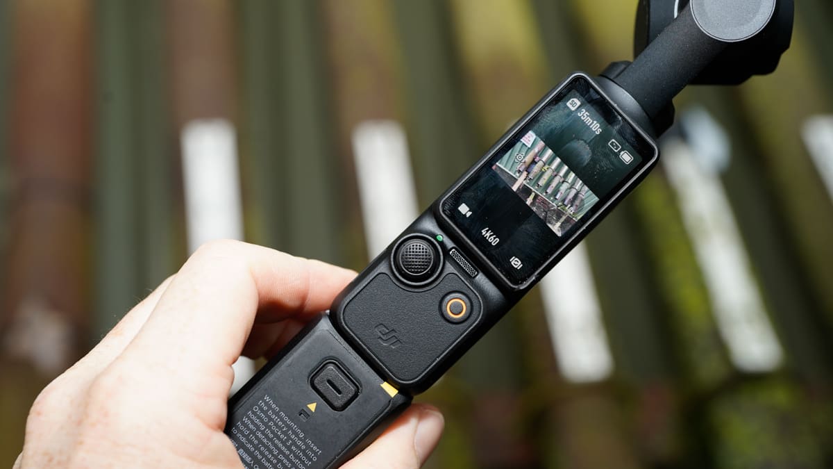
However, the presets have evolved. Active Tracking 6.0 is now outstanding, instantly giving your solo-shot videos a professional touch. Additionally, the gimbal tracking works in both landscape and vertical orientations, catering to YouTube and TikTok/Shorts creators. If you’re concerned about recording on another device and the hassle of editing, worry not. The OSMO Pocket 3 enables live streaming of footage without the need for downloading and editing. If you do prefer editing before going live, there’s LightCut, which I’ll cover in a separate review.
In essence, as smartphones took over many functions from cameras, the DJI OSMO Pocket range has aimed to regain its market share with superior video quality and features. It only takes a few minutes with the OSMO Pocket 3 to notice the difference. With or without the handle, it’s more manageable, and you can even mount it on a tripod and have it follow you.
While the DJI OSMO Mobile phone gimbal offers similar tracking capabilities, you still face issues related to phone storage and battery life. With the OSMO Pocket 3, it’s all about the Pocket’s extended and consistent battery life.
In terms of quality, the 1-inch sensor impresses immediately with video quality comparable to the DJI OSMO Action 4. Moreover, like the Action, the Pocket offers 10-bit D-Log M and 10-bit HLG, enabling seamless integration of OSMO Pocket 3 footage into more professional productions.
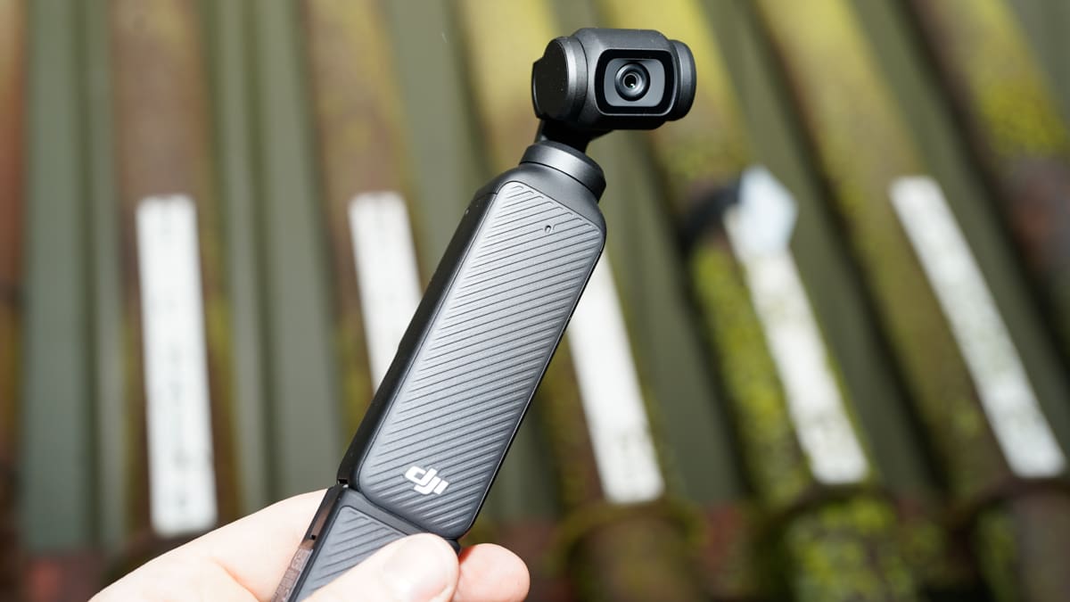
My time with the OSMO Pocket 3 has been relatively short, but I’m already incredibly impressed with the camera’s results. I’ll update the review with footage and a breakdown of the Mimo App soon.
Sound quality from the OSMO Pocket 3 is also surprisingly good, with the small microphone picking up audio effectively and managing to isolate vocals from background noise. However, once the wireless mic is attached, the game changes entirely, delivering not only improved audio quality but also enhancing the overall usefulness of the device.
Final Thoughts
The DJI OSMO Pocket 3 represents a significant leap forward in its core function as a pocket-sized video recorder, evolving into a powerful tool for videographers and content creators. While the built-in presets are serviceable, they may feel somewhat outdated and gimmicky when compared to the true capabilities this handheld camera now offers.
The extended battery life positions this device as a highly viable solution for vloggers and content creators seeking a lightweight yet high-quality tool for capturing video. What’s more, when combined with the battery grip and wireless microphone, you have a system that’s nearly unbeatable.
The generous 1-inch sensor captures breathtaking footage, and the controls provide ample options for fine-tuning your shots. I particularly appreciate the 2-inch screen that swivels to switch between horizontal and vertical shooting—it’s intuitive and practical. Connecting to your mobile phone for local network live streaming is remarkably straightforward, and if DJI were to introduce a multi-cam Mimo App, it would only enhance the experience.
Overall, the DJI OSMO Pocket 3 is an outstanding device. When compared to most competitors in the vlogging camera market, it’s hard not to conclude that they’re simply wasting their time. This camera streamlines the entire process, especially with the wireless microphone option, so why complicate your life with larger and more cumbersome solutions?
The original OSMO Pocket showed potential, the OSMO Pocket 2 added features, and now the OSMO Pocket 3 offers the most comprehensive solution for the rapidly expanding video sector.
Currently, there are ongoing app updates and features awaiting activation, so I’ll revisit this review once the full retail release is available. As it stands, the DJI OSMO Pocket 3 is a solid purchase, offering a more cost-effective and convenient option compared to any of its competitors.
For more information check out the DJI.com product page
