Think of colour management, and we instantly associate it with monitors and print. Traditionally this involved making sure that the image that we see on screen transfers accurately to paper.
However, the same transfer of image qualities are just as crucial for any image destination, and colour management is essential whatever the intended image use.
Today our pictures are on mass destined for online and will be seen on a multitude of devices. Making sure that your image is both captured and processed correctly is more important than ever before. At each stage of the process; from capture to development and output, colour management is essential.
By ensuring that your image meets certain colour standards you can be sure that your image will look as good on other peoples screens as they do on your own.
As with the world of print where papers have different rates of absorption and surface properties that change the colour and tone of an image, today different screens can have a very similar effect.
Some screens have a wide gamut and are able to show a huge range of shadow and highlight detail, while others will clip into shadows and highlights resulting in subtle tone transforming into large blocks of absolute black or white.
To combat this issue Datacolor has created a complete workflow solution that will help with your complete colour management from image capture to upload.
One important feature for colour management in the modern day is Soft proofing. This enables you to preview how the image will look on other screens and devices as well as papers.
Using Soft Proofing to ensure accurate colour
When it comes to the process of capturing images colour management is the same for both print and digital output.
In the field use the SpyderCheckr, SpyderCube or both to ensure an accurate reference point. This reference can be used for enhancement and correction back in the digital darkroom.
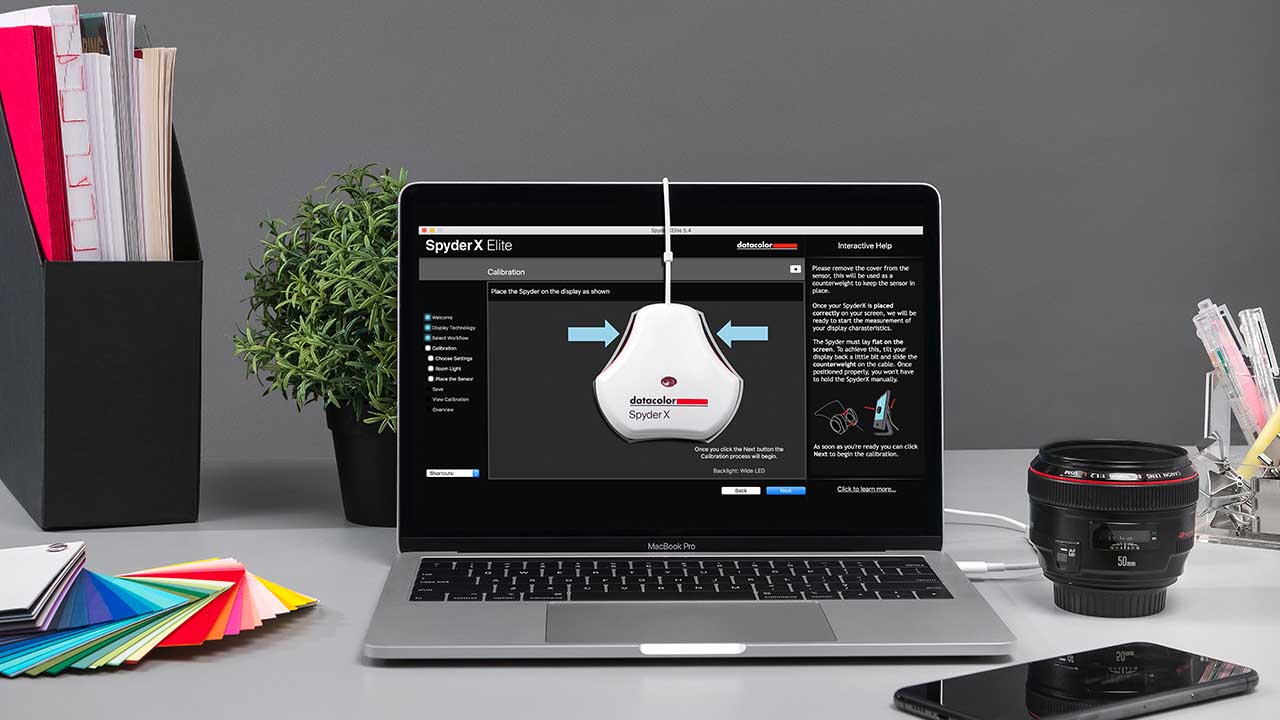
Image captured and in the digital darkroom, the colour management process continues with a monitor calibrated with the Datacolor SpyderX. A monthly re-calibration should always be carried out to ensure that your display is always showing the right colours.
While you adhere to the principles of colour management, not everyone who views your images will? There’s no way to ensure that every screen is calibrated or can even show the same level of colour and detail.
But, if you check your images with soft proof you can at least be sure that your pictures will look as good as possible on the maximum amount of displays.
SpyderX Elite features a comprehensive soft proofing option. Boot up SpyderX Elite and select PrinterSoftproofing and Mobile/Tablet Simulation, then load in your image.
You can then select the device to simulate from the dropdown list. A big advantage here is the preview and gamut warning. Switch these on to see firstly how the image will look and secondly what tones are being clipped.
For example, if you have processed an image in Adobe RGB and want to see how it will look on a standard smartphone then select sRGB.
The preview of your image will appear and overlaying it will be a grey mask highlighting all the clipped tones. A little re-edit of the colours and you can re-evaluate, ensuring that the image you’ve previewed will be as close to what you see on other peoples displays as possible.
Colour management isn’t just important for print, it’s essential in today’s world of sharing and displaying images online.
If you know that the picture you see on your calibrated screen is correct then you can be sure that it will be displayed else where, in a similar light.
Upgrade to DataColor SpyderX Pro or SpyderX Elite
From 9th to 15th September 2019 Datacolor will be carrying out an upgrade promotion!
To discover more on the offers available check out https://www.datacolor.com/spyder/


