Buying a new monitor for imaging can be a minefield, there’s a huge amount of choice, but it soon becomes apparent that not all monitors despite the size and resolution are the same.
The biggest issue for enthusiast photographers is finding a monitor that will accurately display colour and tone without breaking the bank.
When it comes to digital images you also need a monitor that’s a decent size, 24” or more. Size really does matter as the scale will enable you to properly review your images and spot any flaws during enhancement process. It’s also good to be able to see the image bright, clear and crisp prior to sending to the file to the printers.
A quick search for a 24” monitor will turn-up a good selection, but you need to be mindful that the majority of these are for general use. They are essentially cheap monitors that are designed for display, but not with 100% accuracy when it comes to colour, tone and contrast.
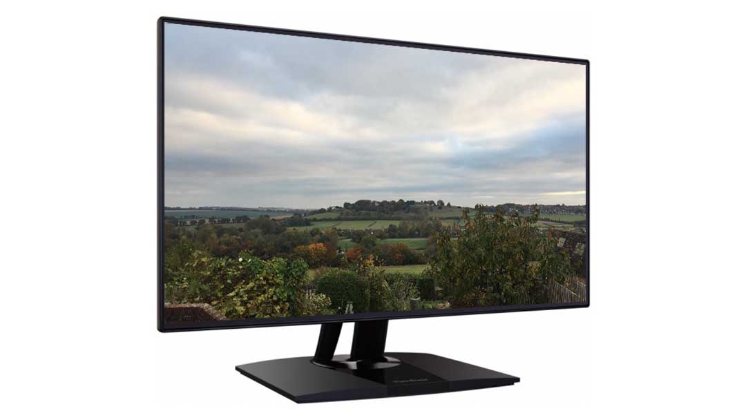
For photography or indeed any imaging application you do need to spend a little more, and the ViewSonic VP2468 is perfectly suited.
At around £250 the price will seem expensive to some, especially when compared with general use monitors, but in real terms this is just about as cheap as it gets when it comes to graphics.
The price, at least initially, gave me some concerns that the monitor was going to end up being purely style over substance, but having owned several ViewSonic monitors in the past I was hopeful that this monitor would live up to my previous experiences.
If nothing else initial impressions are good, then zero frame design instantly gives the monitor an ultra modern and professional look and style, in fact it makes my mac monitor look decidedly old (Which it is!).
Out of the box, connecting the stand and wiring it into my computer was all easy and straightforward with no additional power supplies. The stand is also nicely designed and sturdy without wobble.
The stand also enables you to tilt and swivel the monitor which is especially useful when viewing some colleagues extensive infographics.
Here the zero frame design really finishes off the images nicely and the thin border means that it’s ideal for a multi monitor setup.
It’s also handy that it has auto orientation due to a built in G-Sensor so there’s no delving into menus and settings each time you swivel the monitor.
The monitor is equipped with a good amount of options for connection with a Mini DisplayPort, dual HDMI and four USB 3.0 ports.
The display panel is a 23.8 “ viewable Full HD IPS, and has a good viewing angle, quoted at 178 which seemed to ring true, and all round the colour representation and display of tonal graduation is excellent.
The monitor arrives factory calibrated to Delta E with a 99% sRGB colour coverage and includes a good selection of color spaces including, sRGB, EBU, SMPTE-C, REC7098 and DICOM-SIM.
All monitor settings can be accessed behind the right side of the screen and the function for each button appears as a graphic overlay on screen. The design and navigation of the interface is simple but effective.
I calibrated our sample with the colormunki Photo and once done the reproduction of colour and tone was excellent and you’d be hard pushed to see the difference between this and a monitor twice the price.
The monitor actually features it’s own calibration software that has been co-developed with X-rite, which further underlines this monitors pedigree. The software is designed to work with the X-rite CS-XRi1, I1 Display pro and I1 pro 2.
Used for graphics the refresh rate of 60hz is perfectly adequate and even if editing video you really won’t have any issues. The only real downside is the resolution, which at Full HD does feel a little on the low side, especially with the uptake of 4K. However at present you’re unlikely to find anything else that matches the features and price.


