One area that every photographer must consider is the use of colour. It is a key part of every image’s identity and can even be a factor in how long a viewer rests their eyes upon the photo. It has also played a role in the way we associate certain photos with certain genres. For example, virtually every photographer would agree that a black and white photo is likely to be more evocative of street photography thanks to the work of pioneers like Cartier-Bresson who created distinctive street shots using only black and white film.
On the other end of the visual spectrum, colour has most often been used in photography over the years in particular areas like marketing and advertising. Modern photographers are increasingly leveraging bright and saturated colours to create striking and impactful imagery. This approach also uses bold, vibrant hues to draw attention and evoke emotion. After all, colour is a great way to stimulate our retinal range, and as many studies over the years have shown, certain colours trigger a psychological response.
For example, cooler colours like blue are known to have a calming effect on our mind, and stronger colours like red invoke connotations of danger and alertness. More interesting perhaps, is that not all of us can distinguish certain hues, despite our eyes being able to perceive millions of them. This is partly why bold colour photography stands out from the rest, and why it speaks to us in the visual manner it does. In recent advertising campaigns, high-contrast combinations have been used to help people and products stand out amongst the competition.
Why Bold Colour Portraits Work in 2025
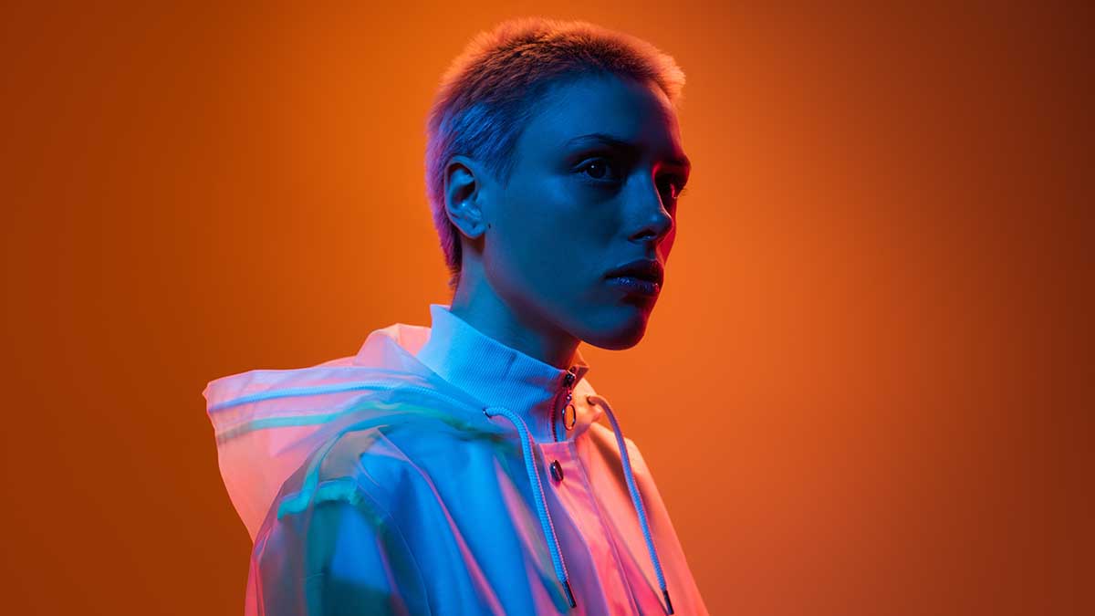
There are a number of reasons as to why bold colour portraits are gradually becoming more popular. Photo-oriented and user-friendly social media platforms like Instagram have effectively become handheld editing suites akin to Photoshop, with numerous updates providing users with greater control over lighting, hues and other settings.
In fact, even a simple portrait taken on an iPhone with minimal colour can be turned into a striking image in a matter of seconds. simply by adjusting the saturation slider and changing the contrast level. As such, there has never been a more accessible time for us to experiment with exaggerated styles. Additionally, when done effectively, bold colour portraits can do more than just stand out – they can also shift our perception of the overall image through the aforementioned colour psychology.
Planning Your Shoot: Backdrops, Lighting & Colour Matching
When planning your shoot, there are a number of things to consider. Backdrops are a key tool in this genre as they can be utilised to provide a contrast to the subject or the subject’s outfit. For example, a bright yellow outfit might look good against an equally bright yellow background, but it would stand out even more against a pink wallpaper, resulting in a visually-engaging image. Of course, that is not to say that colour matching is not effective either – it can be, particularly when the differences in hue are subtle. For example, a bright red background with a darker red hoodie would likely create an equally engaging image.
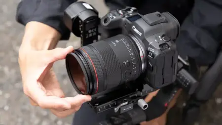
Your choice of camera will also play a key role in how the image turns out, but with so many on the market, what camera is best suited to shooting bold colour portraits? Well, the Canon EOS R8 is a strong contender in this category thanks to a number of features. Its excellent colour reproduction and naturally warm rendering makes it ideal for bold colour portraits. Additionally, the R8 has a smooth contrast curve, which means your portraits will naturally look sharper, requiring less editing.
The R8’s contrast levels are enhanced by Canon’s strong dynamic range, capturing more information in both light and dark environments. The R8 also benefits from some fantastic autofocus capabilities from the R6 Mark II, and similarly to the Profoto B10 Flash, the R8 is equally portable and lightweight, making it a must if you plan to shoot far from a studio.
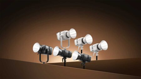
Lighting plays an equally important role, as it can determine the intensity of the hues and colour palette. In this regard, the Profoto B10 Flash is a great choice for colour portraits thanks to its sheer versatility. The B10 Flash is an incredibly lightweight, portable and battery-operated flash which is more than capable of delivering fantastic results even in bright daylight, whilst still being compact and light enough to fit in any small camera bag. The added benefit of its battery-powered design makes it a strong contender for those wanting to have more flexibility in their colour portrait shoots.
Additionally, it also features a robust design and strong build quality, characterised by a tough exterior shell which is highly effective in shielding the unit from falls, scratches and bumps. The screen located on the rear of the flash is also protected by an extruding plastic shield, while the front of the unit features a very handy protective rubber grip for added durability. On the other hand, if you do decide to stick with studio lighting then you should consider using colour gels to bathe the subject in a colour that best suits the backdrop.
Editing Techniques for Colour Enhancement
When editing colour portraits, you should consider the difference between colour grading and colour correction. While both sound similar, only one of them is focused on colour enhancement; colour correction is all about making the palette look more realistic, while colour grading is designed to stylize the image with heightened saturation levels. You should play around with both to see what suits your image best.
When to Go Subtle: Avoiding Over-Saturation
It may be tempting to see just how far you can take an image in the editing room by bumping up the saturation, adding various effects and so forth. But change the contrast levels too much, and you will lose sight of the original and end up with a blown-out image that may even hurt to look at. It is best to avoid those overblown highlights and too much colour saturation. Instead, you should consider the tone of your overall image, taking into account elements like depth of field, noise levels and the natural colour palette. Once these elements have been taken into account, then subtle saturation adjustments can enhance the image without drastically altering it.
Leave a Reply