Master colour theory to elevate your photography
In the vibrant world of photography, colour palettes are about much more than just eye candy. They are a way to tap in to the psychology of our viewers and draw responses. They can influence our emotions, guide our eyes and even alter the overall atmosphere.
They can also transform regular, everyday photos into much more meaningful images. The psychology behind the use of colour in photography is long established and can influence our reaction to what we see.
For example, it is well known that cooler colour palettes like soft blues and greens have a calming effect on our minds, while colours like bright red and yellow trigger a sense of urgency and potential threat. Of course, the intensity of any colour can be vastly different and therefore draw different reactions. A softer, darker red for example, is more likely to invoke suggestions of passion that that of immediate danger.
Effectively, it is easiest to characterise colour-driven photographs into two separate palettes – vibrant and muted. But with basic colour theory aside, how can we move past the surface of colour photography and unlock its full potential? Well, the best way to achieve this is to really think about what kind of mood or message you want your photos to communicate.
Are you planning on producing a one-off shoot experimenting with colour, or do you want to make your collective body of work as a whole more recognisable? If it is the latter, then a consistent colour palette can make your work much more distinctive, helping you to create a visual signature of sorts.
Colour Harmonies in the Real World
Historically, colour has been utilised in a number of ways in photography, mostly to fit certain genres or help our viewers categorise them into subsections. But that doesn’t mean that those ideas cannot be reshaped or changed in a way that challenges their conventions. Monochrome photography is a great example of this. When we think of monochrome photography, dramatic black and white landscape images are usually the first things that come to mind.
But contrary to popular belief, monochrome photography doesn’t have to be exclusively in black and white, it’s just that many photographers decided to keep shooting in that way because of its associated history, as traditionally monochrome photographs would be made from a gelatine silver process, giving them a serious, monotone look.
But other hues can still be used besides just black and white since monochrome actually means using tones of one specific colour to show a different amount of light and shadow. Therefore, any image with shades of just one colour can be classed as monochrome.
Ultimately, the purpose of monochrome photography is to simplify the photo by removing multiple colours and replacing them with just one. This is often the quickest way to get your viewer to focus on elements like composition, texture, shape, and light.
On the other hand, analogous colours can be used in your photos. These colours sit next to each other on the colour wheel and share a common hue like yellow and orange for example. Essentially, they create a more serene and calming feel because the colours blend in more seamlessly instead of violently juxtaposing each other.
With smoother contrast levels, analogous colours are generally found in nature photography and the lack of jarring colour shifts means that the viewer’s eye moves smoothly across the image at their own pace, observing its texture and form.
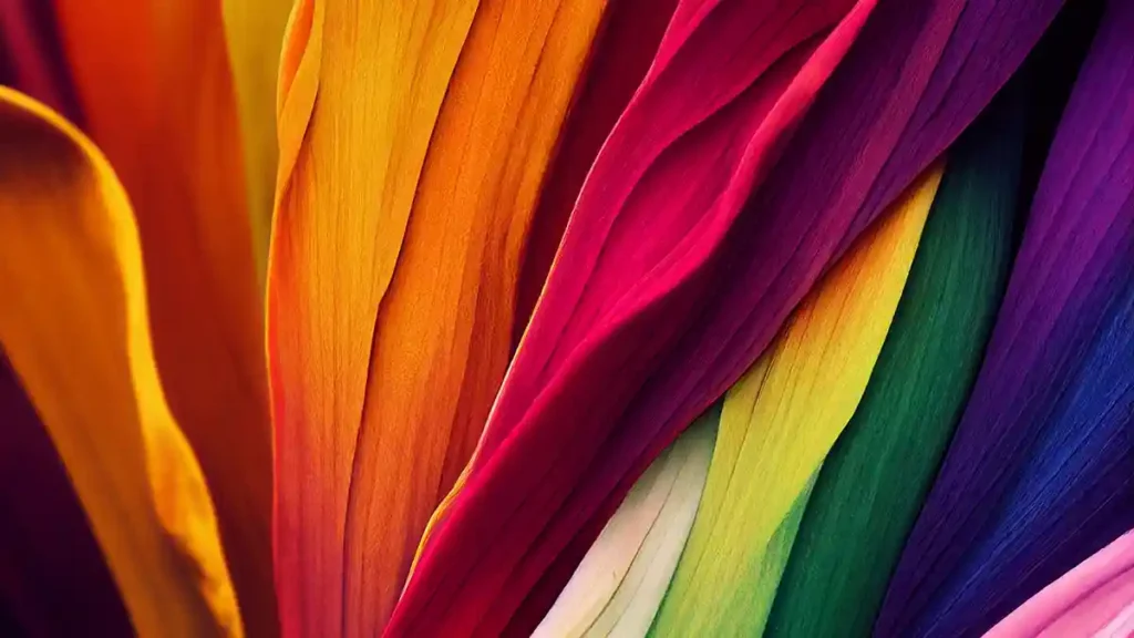
Finally, you have complementary colours. These are colours that sit directly opposite each other on the colour wheel such as blue and orange or red and green.
As you would expect, the purpose of complementary colours is to juxtapose each other in a way that creates strong visual contrast, vibrancy, and a dynamic look that immediately grabs the viewer’s attention. This high contrast level makes the image pop and can be quite engaging with minimal editing work.
Choosing Locations and Wardrobes with Colour in Mind
Whilst it is often a matter of personal preference, you may find that certain locations are better suited to certain colours. An image of a seaside town for example may have several blue and white painted storefronts. A cluster of these can make for an image that stands out, especially when taken during golden hour.
Alternatively, countryside shots may work particularly well during a clear summer’s day, as the green colour palette will naturally appear warmer and more saturated, eliminating the need for additional editing adjustments.
If you are shooting a subject by themselves, consider the colour choices in their costume. Does the colour of their outfit stand out, or blend into the background? Consider your overall intention with the image and adjust the wardrobe colours accordingly.
Editing to Nudge a Palette, Not Replace It
Arguably, the biggest factor in achieving a distinctive look in colour-driven photography is the work that is done in post. While you may have a limited colour palette to work with when shooting, it is here that you generally have more creative freedom to work with.
To reinforce a mood, try adjusting the contrast levels and experimenting with the saturation slider to change the tone. Normally, subtle shifts in white balance and saturation tend to work best, but you should experiment with all of these elements to find the look that you want.
Building a Personal “Look” Over Time
Once you are well versed in the world of colour photography, you may start to notice a pattern in your work. Maybe you prefer certain colours and angles, or find that certain colours work better with certain subjects.
To really build your own style, you should also look at other work besides your own, to see how others in the medium are using colour. When you find a photo you like, keep it handy for future reference in case you want to emulate it at some point during a future project.
In conclusion, colour is a powerful visual tool that can be used in many ways in photography. Whether you want to stimulate the viewer with as much vibrant colour as possible, or want them to feel a certain mood or emotion, there are a plethora of creative opportunities in the colour palette you choose to use.
By understanding the emotional tone behind these colour palettes, as well as making minor editing adjustments where necessary, you can start to produce more compelling work and make deliberate colour-driven choices that represent your style.