Datacolor Spydercheckr Snap Verdict
Need to upgrade your image quality then look no further than the Datacolor Spydercheckr.
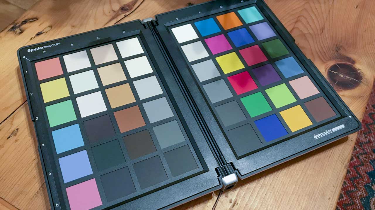
This 48 swatch colour card ensures you get exposure, contrast, and colour right every time.
The colour and grey cards are protected by a hinged hard case that makes it easy to transport and carry the delicate charts within.
It also features a tripod mount and fade indicators, all handy and essential.
As colour cards go, the design and features are as ever simple but essential, offering a decent sized colour management solution that I would highly recommend.
For Datacolor Spydercheckr
- Decent size
- 48 Colour Swatches
- Grey card
Against Datacolor Spydercheckr
- Heavier than competition
- Expensive
Colour management is a photographic process so often overlooked, which is ridiculous because it can save you both time and money.
If you’re not familiar with the magic of colour cards then prepare to be amazed, they will quite literally revolutionise your photographic world.
Imagine one device that would enable you to eradicate colour casts, sort exposures, and balance contrast all with a single, well almost, click.
Ultimately this is possible with the Datacolor Spydercheckr, and of course, like all the best things on the surface at least it all looks very unassuming.
Features
Usually, aside from reeling off the swatch values, there would be little else to cover on features for what is ultimately a colour card.
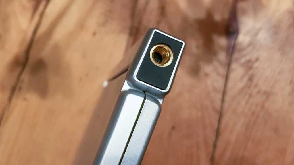
OK, with the SpyderCheckr there are two colour cards, and each is reversible with grey swatches on the back, there’s a hard case a 1/4-inch thread on the base and retractable 1/4-inch thread on the top.
But are these additional features needed or are they gloss on what is essentially a straightforward product.
A colour card’s basic function is to ensure that you get colours right; take a picture of the card in the lighting conditions you’ll be using for the rest of the shoot, and then use it later as the colour reference.
Datacolor, being colour experts, have put a little more thought into the card to ensure that their solution is fully tuned to the jobbing photographer. Or anyone who likes to get things right.
The first big difference between this and the competition is that it arrives in a hard case. This is part of the design and integral to the card’s ease of use.
There are other colour cards out there that also arrive in a hard case but not at this size.
Full dimensions closed are 15 x 23 x 1.5cm (w x h x d), roughly the same size as an iPad mini.
This makes it nice, tactile, and easy to handle. Opening the chart out and the width efficiently doubles.
The design is very like a book, and using book terminology to describe the parts you’ll find a 1/4-inch thread at the tail enabling the charts to be mounted on a tripod. There’s another 1/4-inch retractable screw at the head where a calibration cube or other device could be installed.
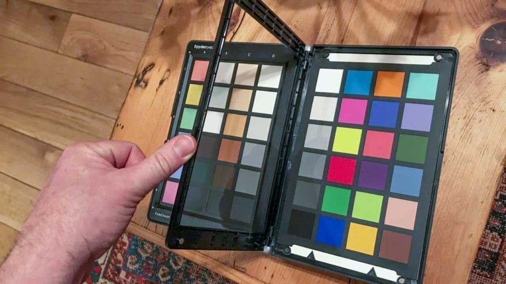
On the inner covers, (I’ve now tired of book terminology) are the two colour charts one saturated and the other low saturated.
Each chart is held in place by a magnetic frame which can be undone so the cards can be removed and flipped to reveal the grey cards.
The grey squares on each chart go in 20% steps, or if you cross between the two charts in a zigzag then 10% steps.
The colours cover skin tones, white tints, black tints, and RGBCM&Y Saturation.
On the edge of the colour chart is a small red indicator that will highlight if the charts have started to fade.
Due to the design, if any charts do get damaged, then new charts are available.
Build quality and handling
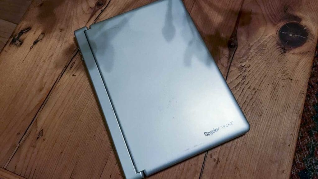
From the outside, the SpyderCheckr looks very unassuming; there is nothing to it. Just a hard grey/silver hinged case with a small logo.
Flip it open, and it reveals the vibrant colour cards inside.
The entire design makes sense. Over the years, I have had several colour cards and calibration devices of one type or another.
I rarely shoot in a studio, and these days I’ll often be taking both stills and video at the same time, if not simultaneously then at least on the same shoot.
My present colour card is well looked after; it has its own pocket in one of my camera bags and is encased with tough card either side to stop it from getting damaged.
However, it’s still starting to look tatty – the SpyderCheckr, that has for the month of testing, been in the bag as well.
It, however, has not been treated to the same delicate treatment, essentially being tucked up and put to bed after use.
The reason isn’t that it’s a review sample, so I don’t care about its well-being, but more that it doesn’t need to be cared for to the same degree. I mean, I’m still not going to chuck it across the room hoping it’ll find the bag, but equally, I won’t go through the same delicate, time-consuming ritual of protection that I offer my present colour card.
Essentially, the SpyderCheckr is tough, it has a few scratches on the case, and the logo has started to wear away, but inside it’s still as fresh as the day it arrived.
The build is solid, the case is tough, and it feels well-made. The 1/4-inch thread is brass, not just plastic, so it will last, and when you open it everything feels precise.
The design of the frames works well with their magnetic clasps, although getting the cards to sit correctly can sometimes be a little effort if you try to do it one-handed, one-handed while swigging a sip of coffee is almost impossible, but tackle it like any normal person, and it’s fine.
Performance
It’s a colour card – prop it up or get someone to hold it, photograph it in situ, and that’s it.
All very easy, but actually the design of the case with the 1/4-inch thread does enable you to quickly tripod mount. Handy for landscapes or sitting onto a Manfrotto Pixi.
Using the colour checker side is all easy enough, take your image of the chart in each lighting situation you’re in, and then you can use that image in the digital darkroom when developing.
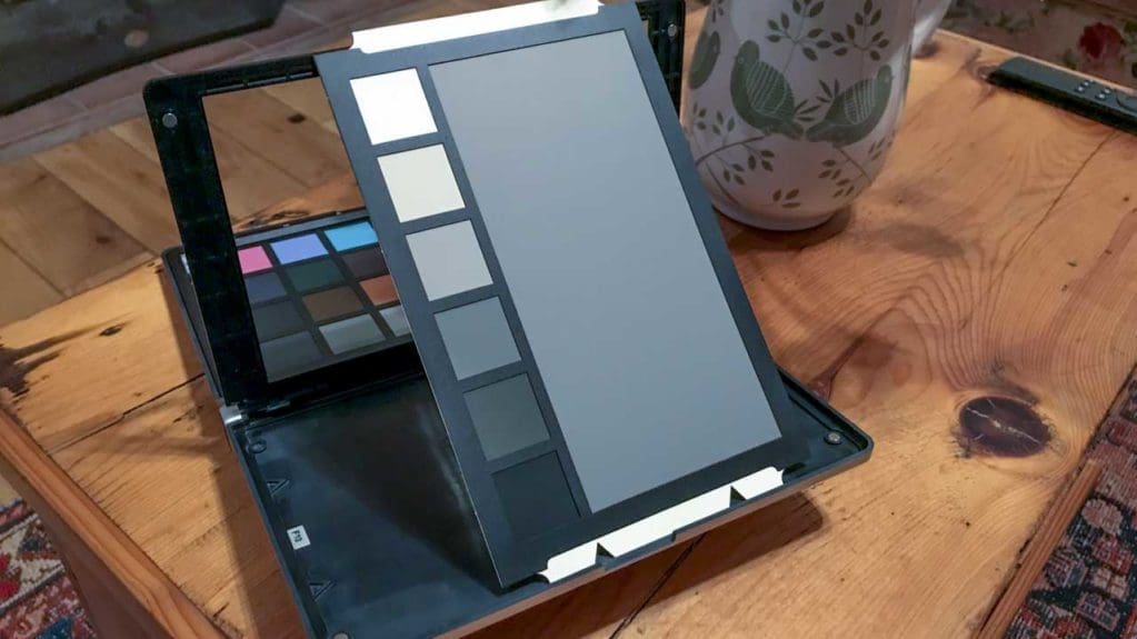
Once the colour side of the card has been shot and you’re back in the digital darkroom, you can then use the downloadable SpyderCheckr app to calibrate your images’ colours.
Once downloaded, you load up your colour chart image, adjust the settings in Lightroom or Photoshop. The colour chart image can be cropped in. The colour chart can then be adjusted to show white at 96% and black at 4%, which is highly unlikely at this stage.
The first step is to correct colour cast by clicking into the second grey square down in the full saturated card, then adjust the exposure to get the white values as close to 96% as possible and then the black values as close to 4%.
Once done, you can then access the SpyderCheckr app directly through Lightroom or Photoshop, match up the colour swatches, and save down the Calibration.
Once that’s done, the preset created can be applied to all other images with that colour cast, all nice and easy.
Verdict
Colour management is as essential to photography as mounting a lens and using a memory card.
For the sake of a quick picture, the colour reference that it gives you will save you hours in the digital darkroom trying to balance colour and exposure.
As an enthusiast photographer, the revelation of correct colour management is often one of the biggest steps forward that you can make, and the SpyderCheckr is a robust and easy to use solution.
The design ensures that the delicate chart surfaces are protected, and features such as the 1/4-inch thread and fade indicators all add to the chart’s value.
As with all charts, the SpyderCheckr is phenomenally expensive at just over £100, but for pro and enthusiast alike the benefits are well worth the price for a piece of kit that will last for years and exponentially improve your photography.
